Microsoft revamps logo for first time in 25 years
Published 24 Aug, 2012 10:16 | Updated 24 Aug, 2012 15:37
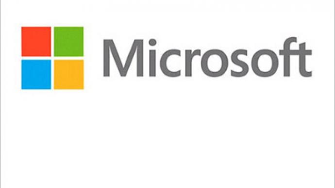
Microsoft Corp. unveiled its first new logo since 1987, as it prepares to introduce a range of new products, from a new version of Windows to the company’s own touch-screen devices.
The logo includes the so-called Segoe font, which is used in Microsoft products and marketing materials, and four colored squares that are “intended to express the company’s diverse portfolio of products,” says Jeff Hansen General Manager of Brand Strategy at Microsoft.This is Microsoft's fifth logo since Bill Gates and Paul Allen founded the company 37 years ago in 1975. The new logo made its debut on Microsoft's websites, as well as three of its retail stores in Boston, Washington and Seattle.
The new look comes ahead of the release of the Windows 8 operating system, and the Surface tablet PC with an ARM Holdings chip on Oct. 26. The new device would be accompanied by a new version of the Office applications. There also will be a Windows 8 for smartphones. “This wave of new releases is not only a reimagining of our most popular products, but also represents a new era for Microsoft,” the company said on the blog. “So our logo should evolve to visually accentuate this new beginning”.Microsoft is trying hard to return to its former leading position in the market. As consumers prefer smartphones and tablets over PCs, Microsoft saw its revenues drop over recent years, while rivals Apple and Google have been conquering the market.


