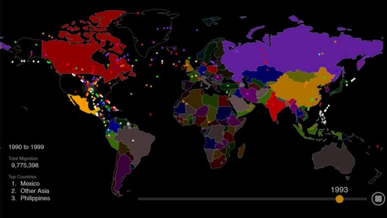
Hypnotic animated map shows 200 years of US immigration in 1 minute (VIDEO)
Published 22 May, 2016 15:41 | Updated 22 May, 2016 20:17
A mesmerizing and very colorful animation of the migration flows into the US has been created, showing where in the world people arrived from over the past two centuries.
Metrocosm used immigration statistics from the Department of Homeland Security to show where a total of 79 million people moved from between 1820 and 2013 to obtain “lawful permanent resident status” in the US.
With each dot signifying 10,000 people, it’s easy to see which countries led the way in migration to America. This data also offers insight into the histories of those population contributing countries, as their residents fled famine, social unrest and conflict for a new life in America.
It’s worth noting that most illegal immigration is not included in the animation.
#Immigration into the U.S. since 1820. #datavizhttps://t.co/PoAw2hG8w2pic.twitter.com/aXxuSKDetu
— Randy Olson (@randal_olson) May 5, 2016
From 1820 to around 1860, a period which would have coincided with the Irish famine, Ireland tops the list as the country sending most migrants to America. UK residents are the second highest migration group on the list.
In the following period, the animation shows a massive influx of Italians, which would have coincided with Italian unification following the collapse of southern Italy. The number of Russians migrating follows closely behind.
From around 1920, an influx of Canadians led the charge, with Mexico not far behind.
Meanwhile, during the rise of Hitler and in the post-World War Two period, German migrants made the move.
USA: A Country of Immigrants pic.twitter.com/JPF5ipMnaN
— ian bremmer (@ianbremmer) May 6, 2016
Mexicans immigrants outnumber all other countries from around 1960 through to 2013.
There is also a marked increase in the influx of Cubans from 1970, coinciding with the Cuban Revolution.
From 1980 onwards, there is a continued increase of immigrants from Philippines, “Other Asia” and China.


